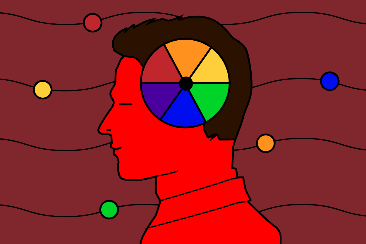
One of the most fundamental aspects of color theory is the idea that each color represents some type of emotion. If an artist wants their audience to feel a certain way while looking at their work, they’ll use specific colors that work well together. If you have ever felt sad looking at a piece of art that’s primarily blue, for example, it wasn’t by sheer coincidence.
This is a part of color psychology, a field of study that has been recorded as far back as Ancient Egypt. The basic idea is that every color has a pre-existing and often universal emotional connotation attached to them, even if it’s hard to put into words why this is. While each color can stand on its own, the different shades and combinations that can be made really expands each meaning.
This is especially true in marketing. The meanings of colors in marketing materials aren’t the same as their meanings in more traditional art. Color psychology in marketing is more centered around subconsciously guiding an audience towards making a decision rather than feeling specific emotions, and it’s a tried and tested method.
So, what messages do colors convey in marketing? Here are just a few examples, according to branding agency Iconic Fox:
Red
- Power
- Drive
- Excitement
Orange
- Confidence
- Warmth
- Familiarity
Yellow
- Happiness
- Creativity
- Hope
Green
- Health
- Wellness
- Growth
Blue
- Calmness
- Dependability
- Logic
Purple
- Class
- Wisdom
- Spirituality
This is far from a definitive list, but it should give you a good idea of the importance of color in branding. Context is key in color psychology, which is why blue can be calm in branding and depressing in art.
Perhaps the best example of how powerful color in branding can be comes from the two main soda competitors on the market: Coca-Cola and Pepsi. Both incorporate red and white in their branding, but the way these colors are utilized make them both distinctly appealing to their respective audiences. The red-and-white color palette of Coca-Cola feels exciting and requires immediate action, while the blue-red-and-white palette of Pepsi makes it come across as a more homey and relaxing drink for chilling with friends or family.
Arguably the most important thing about color psychology in branding, however, is to ensure the colors fit your company’s ethos. Each type of company is different and has different goals, so the colors you choose need to fit those goals. For example, if you want to start a nature-centric news website, you shouldn’t keep green out of your color kit. The best way to determine what colors should work the best for your brand is to write down what your company stands for and what you want consumers to feel when doing business together. Afterward, try and match these attributes to the Iconic Fox directory listed above or this HubSpot infographic. From there, the possibilities for your marketing materials and branding are nearly limitless.


