What Happens When You Take Writing Away From Writers?
A newspaper editor removed writing from reporters' jobs. The backlash reveals a deeper question about AI in knowledge work.
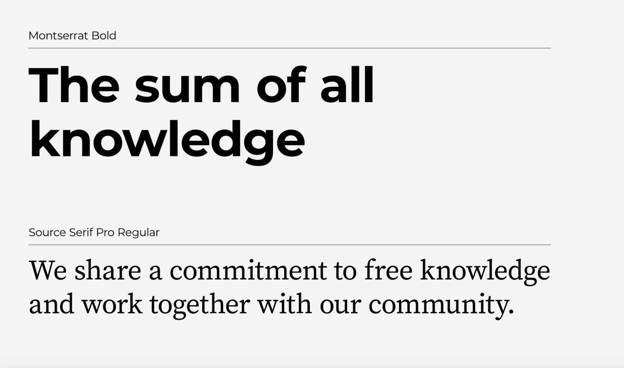
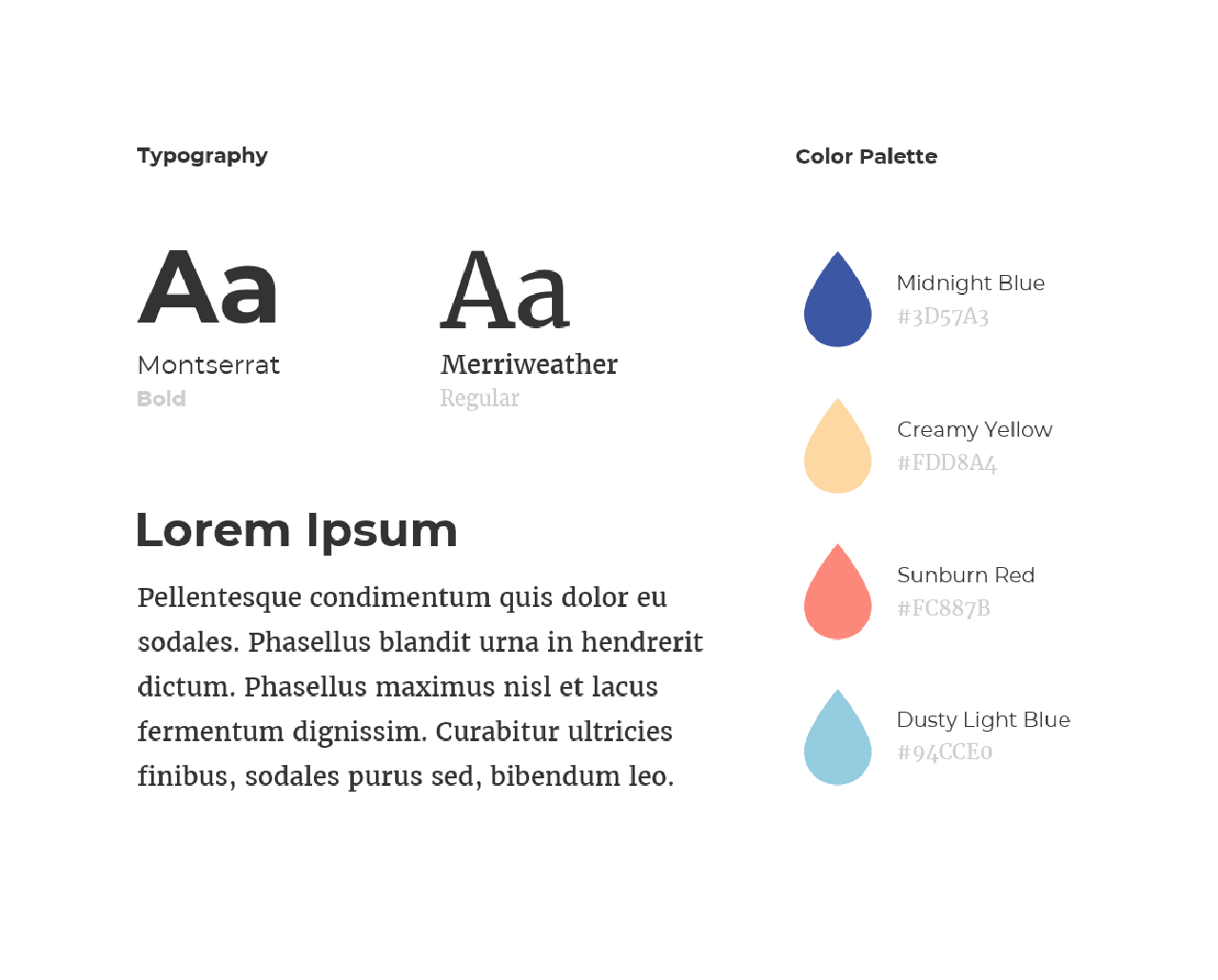
Typography may be overlooked but it is a powerful and crucial tool that speaks volumes in shaping your brand identity and values.

Typography may be overlooked but it is a powerful and crucial tool that speaks volumes in shaping your brand identity and values. Typography refers to the art and technique of arranging fonts, and letterforms to create visually appealing and effective communication.
In this edition, we'll explore how selecting the right fonts can influence your messaging and brand recognition, as well as provide you with valuable insights to help you make informed choices for your own brand.
Typography in Branding
Typography is more than choosing fonts; it’s about expressing the core of your brand visually. Think of typography as your brand’s voice. The way it visually communicates with your audience before they even read the words. Ask yourself these questions when selecting a font- How will this font make someone feel when they look at your brand? How do you want your brand to be conveyed? The right typography can help achieve the brand’s image, make sure it’s visually appealing while also being easy to read.
Fonts Convey Emotions
Fonts have the power to evoke emotion. With lots of different typefaces out there, they all have their own specific characteristics that can bring out emotions. For example, a bold, modern font might convey innovation, confidence, or authoritative, while a classic serif font can communicate tradition, sophistication and reliability. By carefully selecting a font that aligns for your brand, this will help convey what your brand stands for visually.

Staying Consistent and Cohesive with Typography
Consistency is key in branding and typography is no exception. Consistent typography helps people remember and recognize your brand. Choose a specific font and use them consistently across all mediums so that it won’t be confusing for the audience and people will remember consistency. Consistency in typography also goes beyond the same font, it includes the visual hierarchy, line spacing, and font size.

Typography Insights Round-up


Like any design element, it quickly evolves over time. Whether you’re looking for an update for your brand or aiming to stay-ahead of the industry, these insights will keep you in the loop.